Purchase link: https://extensions.siberiancms.com/downloads/accordion-faqs/
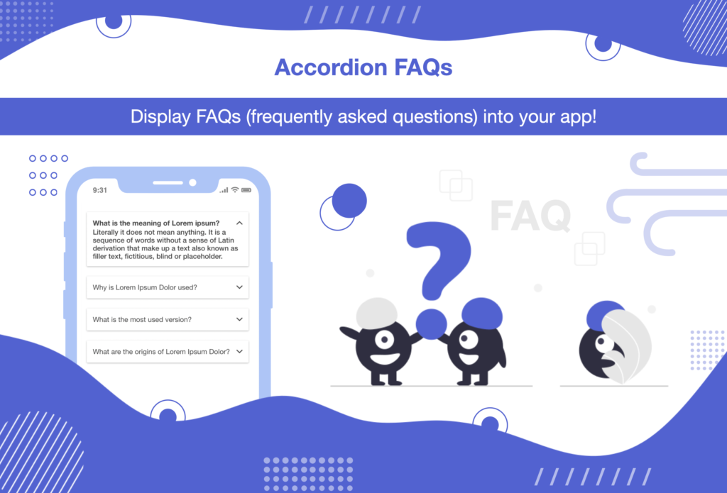
This Accordion FAQs module allows you to display the list of your FAQs into your app.
A FAQ page is one of the most important and must-have section for business apps. Many businesses often get asked about the same common questions over and over again from potential customers. Most online support teams spend hours of their valuable time every day answering these general questions. While it could’ve been easily avoided by placing a FAQs section into the app.
In addition to saving lots of pre-sales calls and support emails, Clear your potential customer’s doubts and improve your customer’s experience just by answering the most common questions immediately using the FAQs.
Module Features:
- Add, edit & delete accordion items.
- Drag & drop re-arrange accordion items positions.
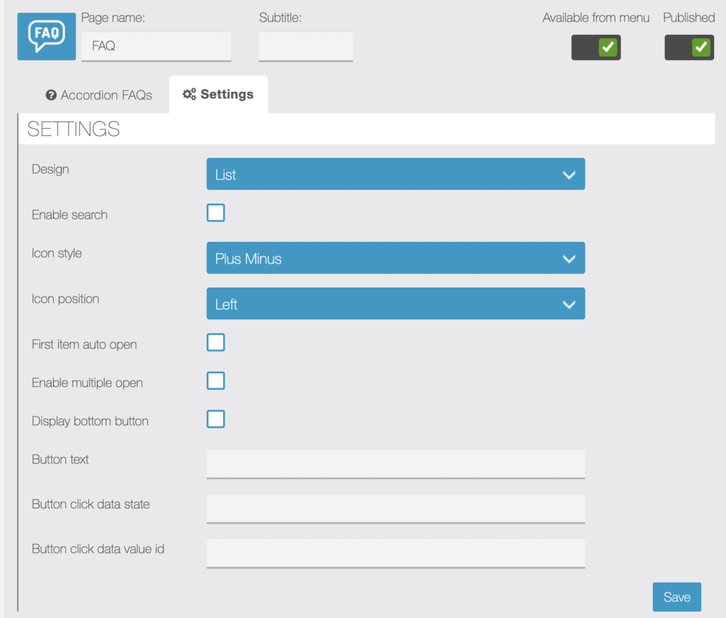
- Option to enable search bar.
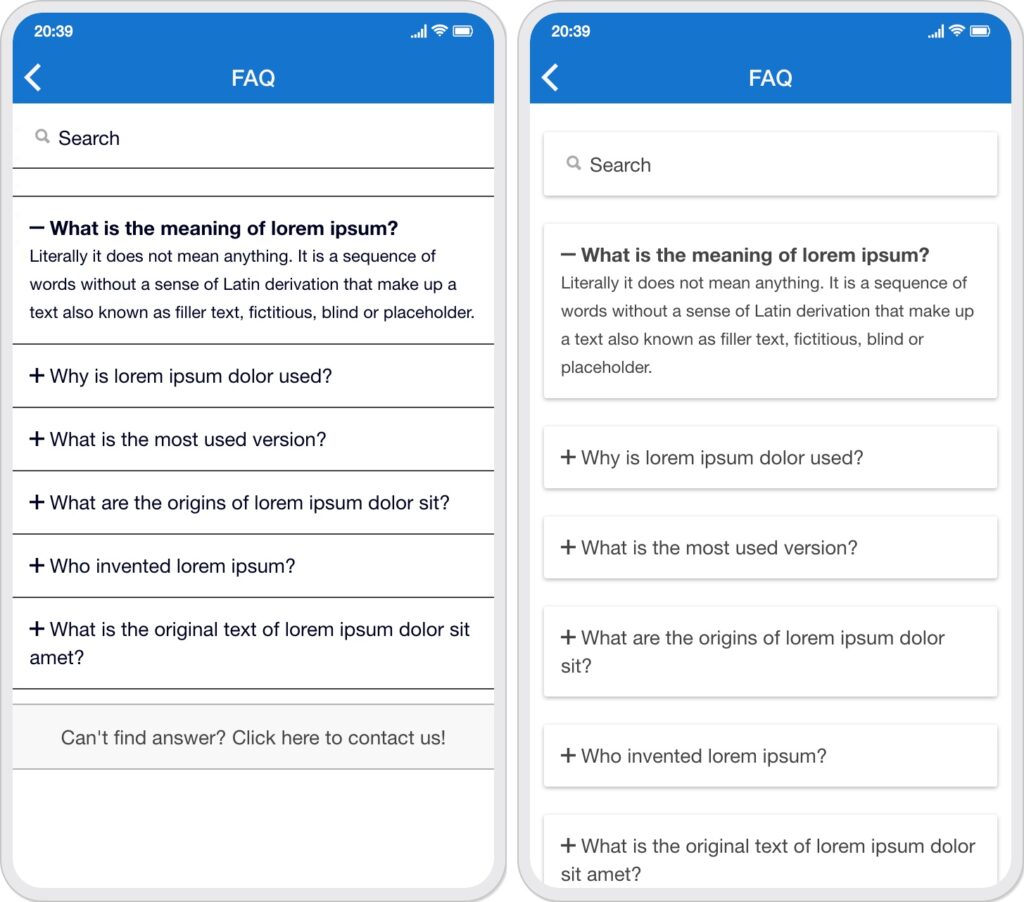
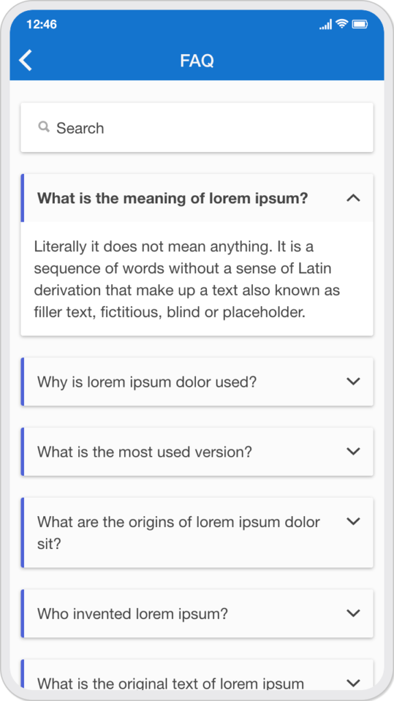
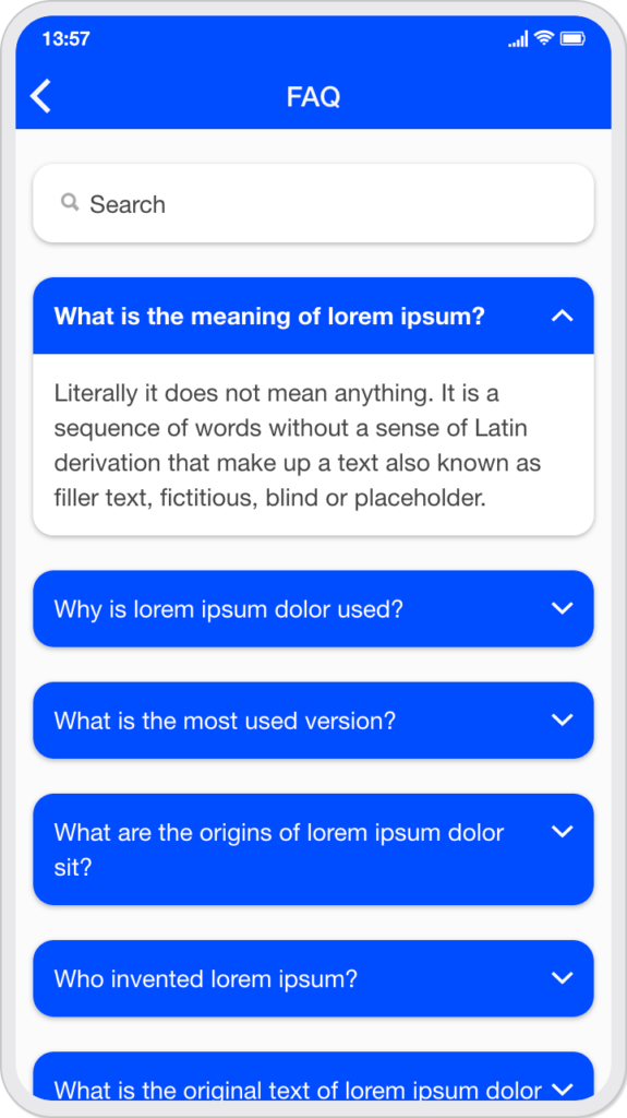
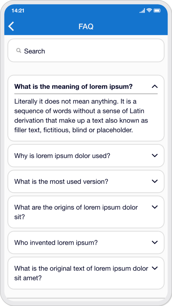
- Option to choose list or card design.
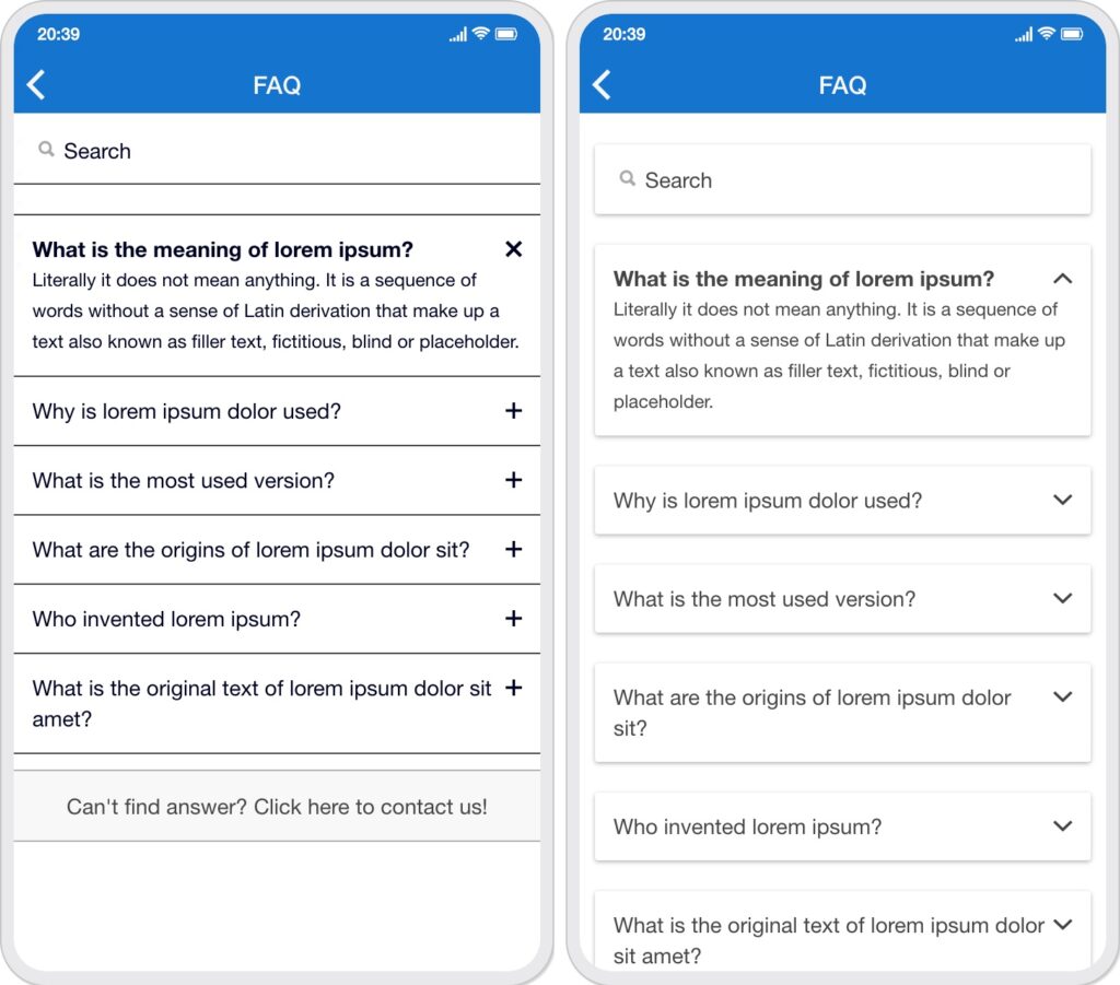
- Four icon style (plus-minus, plus-close, up-down-chevron, up-down-arrow)
- Option to choose icon position left or right.
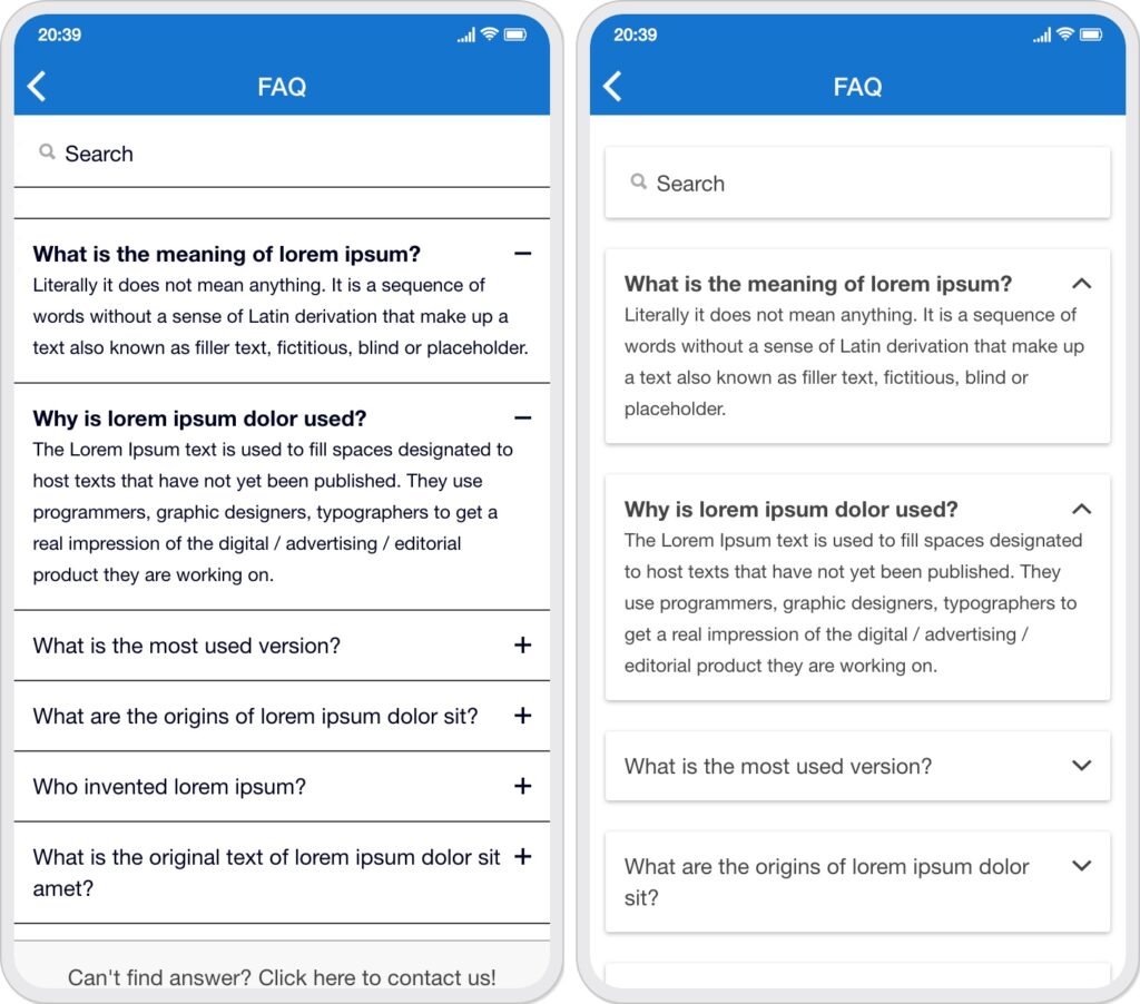
- Option to auto open first accordion item.
- Option to open single or multiple accordions at a time.
- Option to display bottom button with text.
- Option to set in-app link to the bottom button.
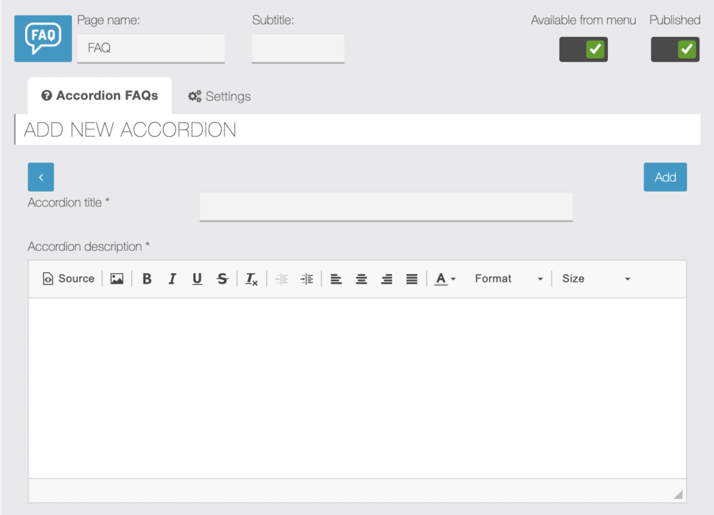
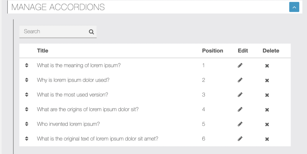
Editor Screen:
Add accordion:
Manage accordions:
Settings:
App Screen:
List / Card Design:
Right Icon:
Multiple Open:
What’s the purpose of the bottom button?
You can use it as a contact button link, so if users can’t find their answer from your FAQs list then it will be very easy for users to contact you. You can link it to your app pages such as contact page, custom page, source code page etc. Just put data state and value id of your in-app-link there.
Suppose your in-app-link is: <a data-offline=”true” data-params=”value_id:898″ data-state=”contact-view”>Contact</a>
You can put contact-view in the button click data state field and 898 in the button click data value id field.
FAQ Module Demo:
Visit: https://appzadmin.com and login with below details:
Email: demo@demo.com
Password: pwademo123
After a login, open any app and go to Features page and add FAQs feature to your app.
Module Update Change-log:
- Version- 1.1.0 March 11, 2022 (iOS Smooth scroll implemented)
CSS code examples:
(1) Module background color:
.module-accordionfaq ion-content { background: #E0E5EC !important; }
(2) Change the background color of an active / open accordion:
.module-accordionfaq .list .item.item-custom.active { background: #f5f5f5; }
(3) Card design border radius & box-shadow:
.module-accordionfaq .card, .module-accordionfaq .button.button-custom {
    border-radius: 12px;
    box-shadow: 0 3px 6px rgba(0, 0, 0, 0.16), 0 3px 6px rgba(0, 0, 0, 0.23);
}

.module-accordionfaq .button.button-custom { border-color: transparent; }
(4) Gradient background color for bottom button:
.module-accordionfaq .button.button-custom { background: linear-gradient(45deg, #7537E7 0%, #35C9FF 100%); }
(5) Change the font-size of accordion description:
.module-accordionfaq .list .item.item-custom p { font-size: 14px; }
(6) Custom style-1 for card design with right icon:
.module-accordionfaq ion-content { background: #fbfbfb !important; }

.module-accordionfaq .card ion-item.item { padding: 0; }

.module-accordionfaq .item.item-custom .faq-title {
    background: #fbfbfb !important;
    border-left: solid 3px #4e63d7;
    padding: 12px;
}

.module-accordionfaq .item.item-custom p {
    padding: 12px;
    font-size: 14px;
}
(7) Custom style-2 for card design with left icon:
.module-accordionfaq ion-content { background: #fbfbfb !important; }

.module-accordionfaq .card ion-item.item { padding: 0; }

.module-accordionfaq .item.item-custom .faq-title {
    background: #fbfbfb !important;
    border-right: solid 3px #4e63d7;
    padding: 12px;
}

.module-accordionfaq .item.item-custom p {
    padding: 12px;
    font-size: 14px;
}
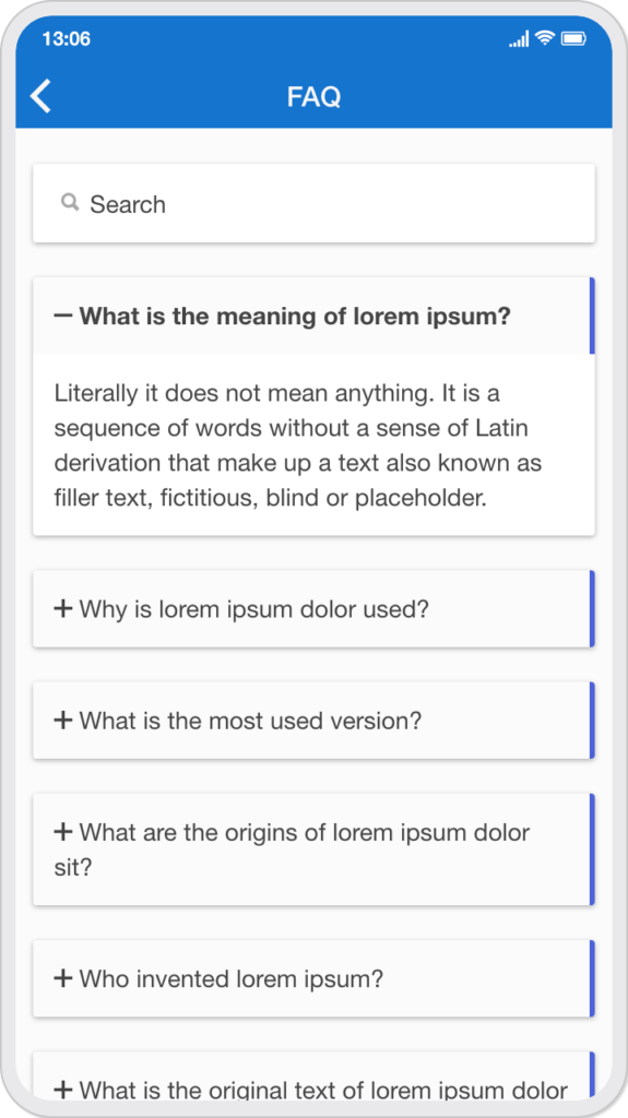
(8) Custom style-3 for card design without search bar and bottom button:
.module-accordionfaq ion-content { background: #d8e9f7 !important; }

.module-accordionfaq .card ion-item.item { padding: 0; }

.module-accordionfaq .item.item-custom .faq-title {
    color: #ffffff !important;
    background: #5938c8 !important;
    padding: 12px;
}

.module-accordionfaq .item.item-custom p {
    padding: 12px;
    font-size: 14px;
    background: #d1ecff !important;
}
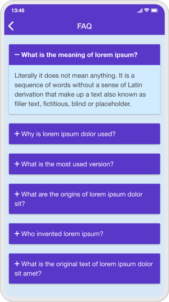
(9) Custom style-4 for card design with border-radius:
.module-accordionfaq ion-content { background: #fbfbfb !important; }

.module-accordionfaq .card ion-item.item { padding: 0; }

.module-accordionfaq .item.item-custom .faq-title {
    color: #ffffff !important;
    background: #004cff !important;
    padding: 12px;
}

.module-accordionfaq .item.item-custom p {
    padding: 12px;
    font-size: 14px;
}

.module-accordionfaq .card, .module-accordionfaq .button.button-custom { border-radius: 12px; }
(10) Custom style-5 for list design with border radius:
.module-accordionfaq ion-content { background: #fbfbfb !important; }

.module-accordionfaq .list .item.item-custom {
    margin: 8px;
    border-color: transparent !important;
    border-radius: 12px;
    box-shadow: 0 0 2px #808080;
}

.module-accordionfaq .item.item-custom p {
    padding-top: 5px;
    font-size: 14px;
}

.module-accordionfaq .item.item-custom.active .faq-title {
    padding-bottom: 5px;
    border-bottom: solid 1px #808080;
}